Calculators are everywhere – from mortgage estimators to BMI checkers. But most are frustrating, confusing, or just plain wrong. The difference between a calculator that converts visitors into users and one that drives them away often comes down to a few simple choices.
Here are the essential dos and don'ts for creating a great calculator (whether you build it from scratch or upload an Excel file to Kalkulatorly.online).
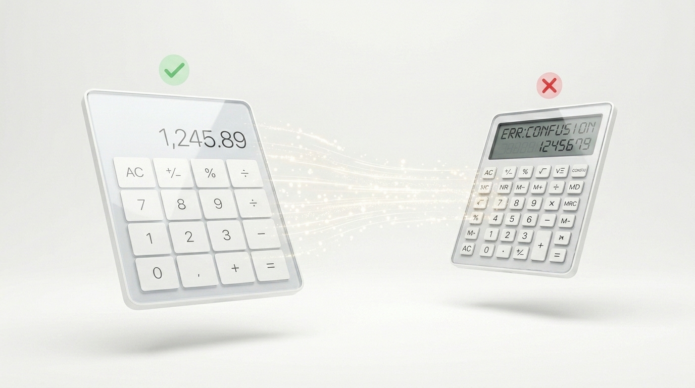
✅ The Dos
1. Start with a single, clear goal
What is the one question your calculator answers? "How much loan can I afford?" or "What's my daily calorie target?" Stick to one job. Adding unrelated fields confuses users and hurts conversion.
2. Label everything in plain language
Use "Monthly income" not "Inc_mth". Use "Interest rate (%)" not "Rate_pct". Your users are not spreadsheet experts. Clear labels reduce errors and support requests.
3. Show the result immediately
No submit button. No "Calculate" click. As soon as the user types or selects an option, update the output in real time. This creates a satisfying, responsive experience.
4. Provide helpful default values
Pre-fill fields with realistic numbers (e.g., loan amount: $250,000). This guides users and shows them how the calculator works without forcing them to guess.
5. Add a short explanation of the result
Instead of just "Result: $1,247", write: "Your estimated monthly payment is $1,247. This includes principal and interest." This builds trust and reduces confusion.
6. Validate inputs gently
If a user enters a negative number where it doesn't make sense, show a friendly error – but don't block the entire calculator. Example: "Please enter an amount greater than zero."
❌ The Don'ts
1. Don't hide the formula or logic
Users trust calculators more when they understand the method. Add a small note: "This calculation uses the standard amortisation formula." Or offer a link to "How we calculate this."
2. Don't use jargon or abbreviations
Avoid "APR", "LTV", "DSCR" without explanation. If you must use them, add a tooltip or short definition.
3. Don't break on mobile
More than 60% of users will access your calculator on a phone. Ensure buttons are large enough, text is readable, and the layout stacks vertically.
4. Don't forget to handle edge cases
What happens when someone enters zero? What if they leave a field empty? Test your calculator with unexpected inputs. A crash or a blank result destroys credibility.
5. Don't overload with unnecessary fields
Every extra field increases drop-off. If a field is not essential to the core calculation, remove it or move it to an "advanced" section.
6. Don't make the user calculate in their head
If your calculator needs two separate inputs that depend on each other (e.g., width and area), build the logic into the tool. Never ask users to do part of the maths themselves.